|
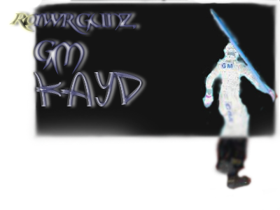
New sigg! =]
|
|
| Hope | Date: Wednesday, 2009-09-02, 5:06 PM | Message # 1 |
 Rabbit
Group: Users
Messages: 1132
Status: Offline
| New siggeh, Tried something different. I had a white render, and I re-colored it. It was something just to try out, but it worked out so well that i did the whole render xDFor the ones who know how to do it, Just use the select tool thingy ( ill mentiont the name later), make an new layer and fill it with the color you want your render to be, set the mode to opacity and it looks sweet xD
Don't blame me if i'm nub  Rate please =]  Once again, rate please =]

^ Yoshino ftw :o
----------------------------------------------------------------------------------

|
| |
|
|
| Yoshino | Date: Wednesday, 2009-09-02, 5:09 PM | Message # 2 |
 Trial Game Mod
Group: Moderators
Messages: 1151
Status: Offline
| Proooo, although on msn I didn't notice how much render looked like it was color coordinated and pasted on Q.Q Cant give you 10/10 :P Personally, I would motion bur the render slightly and set the opacity low. Then paste the same render on top of it. ^^ Still though, 9/10 Gj. :D


|
| |
|
|
| Hope | Date: Wednesday, 2009-09-02, 5:10 PM | Message # 3 |
 Rabbit
Group: Users
Messages: 1132
Status: Offline
| Booo!! You suck! xD Jokes 9/10 Is alot for me tho, and Yosh  I'm in luv wif yur 2nd sig its proo make me one you bastard!!! I'm in luv wif yur 2nd sig its proo make me one you bastard!!!

^ Yoshino ftw :o
----------------------------------------------------------------------------------

|
| |
|
|
| Yoshino | Date: Wednesday, 2009-09-02, 5:12 PM | Message # 4 |
 Trial Game Mod
Group: Moderators
Messages: 1151
Status: Offline
| Its pro Until you realize the paki dot mistake I made. Q.Q


|
| |
|
|
| Hope | Date: Wednesday, 2009-09-02, 5:17 PM | Message # 5 |
 Rabbit
Group: Users
Messages: 1132
Status: Offline
| ROFL I JUST NOTICED ON TEH HEAD 

^ Yoshino ftw :o
----------------------------------------------------------------------------------

|
| |
|
|
| Yoshino | Date: Wednesday, 2009-09-02, 5:49 PM | Message # 6 |
 Trial Game Mod
Group: Moderators
Messages: 1151
Status: Offline
|  http://i28.tinypic.com/10f4bc1.jpg  http://i27.tinypic.com/2sb7m0g.jpg  http://i30.tinypic.com/30sd4pw.png Feel free to take any of those signatures. Which ever one you don't take, I'll just edit the pdf. :P


|
| |
|
|
| Hope | Date: Wednesday, 2009-09-02, 5:52 PM | Message # 7 |
 Rabbit
Group: Users
Messages: 1132
Status: Offline
| Oh lord, Idkw what to take T_T
Well I rly love the 2nd one, but the text is kinda idk how to put this... But like, you can only see when you watch pretty hard :O
Make it moree likee see-able  And for the 3rd one Idk bout the render, doesn't really fit the BG and shit. And for the 1st one; IT rock yur sox!!!! and teach me how to make those BG's Pl0x pro much :O And for the 3rd one Idk bout the render, doesn't really fit the BG and shit. And for the 1st one; IT rock yur sox!!!! and teach me how to make those BG's Pl0x pro much :O

^ Yoshino ftw :o
----------------------------------------------------------------------------------

|
| |
|
|
| Yoshino | Date: Wednesday, 2009-09-02, 5:58 PM | Message # 8 |
 Trial Game Mod
Group: Moderators
Messages: 1151
Status: Offline
| Go hunt down LT. lol 1st one, use it then lol 2nd one, I put the text like that cuz I was going for an inscribed in the sword look. (The sword is Excalibur xD) 3rd one, I rendered that from a stock that had clouds :3 (xD) Ps: Im not CS2'in right now. It's time for d-style :)


|
| |
|
|
| dandelin | Date: Thursday, 2009-09-03, 6:10 PM | Message # 9 |
 RawrGunz Addict
Group: Users
Messages: 670
Status: Offline
| 2/10

|
| |
|
|
| Hope | Date: Thursday, 2009-09-03, 8:31 PM | Message # 10 |
 Rabbit
Group: Users
Messages: 1132
Status: Offline
| Ty, You're signature is sweet. Just learn paint

^ Yoshino ftw :o
----------------------------------------------------------------------------------

|
| |
|
|
| Yoshino | Date: Thursday, 2009-09-03, 11:47 PM | Message # 11 |
 Trial Game Mod
Group: Moderators
Messages: 1151
Status: Offline
| UhHHH Hope, your render's body is black and his face is white! :O :P<3 that's man-kinds future self. :D Proular.


Message edited by Yoshino - Thursday, 2009-09-03, 11:48 PM |
| |
|
|
| LucienWolf | Date: Friday, 2009-09-04, 3:34 AM | Message # 12 |
|
RawrGunz 1337 member
Group: Users
Messages: 1196
Status: Offline
| Actually, I don't like this siggy very much, 7/10, BG doesnt flow with the picture

|
| |
|
|
| Yoshino | Date: Friday, 2009-09-04, 3:55 AM | Message # 13 |
 Trial Game Mod
Group: Moderators
Messages: 1151
Status: Offline
| Quote (LucienWolf) BG doesnt flow with the picture Your insane. That's best flow from Render to BG I've seen from Hope. lol


|
| |
|
|
| ManyBlackPpl | Date: Friday, 2009-09-04, 4:01 AM | Message # 14 |
 RawrGunz Developer
Group: Moderators
Messages: 919
Status: Offline
| Quote (Yoshino) Your insane. That's best flow from Render to BG I've seen from Hope. lol
Key words: From Hope. Not necessarily the best flow though. Actually, I think his previous sig with the knight was amazing, and had great flow. Anyways, I sort of agree with lucien, cuz tbh, the only flow that I can see that sort of matches the render, are the ripples (look really close on the right side). Other than those, I don't really see it. Most of the rest is either moving horizantally or vertically.


|
| |
|
|
| Yoshino | Date: Friday, 2009-09-04, 2:34 PM | Message # 15 |
 Trial Game Mod
Group: Moderators
Messages: 1151
Status: Offline
| Quote (ManyBlackPpl) Key words: From Hope. Duh :P Can't say the best, cuz I've seen your works. :o The knight signature was pro. But I like this one bettar. :P


|
| |
|
|
| LucienWolf | Date: Saturday, 2009-09-05, 3:26 AM | Message # 16 |
|
RawrGunz 1337 member
Group: Users
Messages: 1196
Status: Offline
| Yoshino, are you crazy, almost nothing flows with that BG... he just slabbed a yellow BG behind his render.

|
| |
|
|
| Yoshino | Date: Saturday, 2009-09-05, 6:00 AM | Message # 17 |
 Trial Game Mod
Group: Moderators
Messages: 1151
Status: Offline
| Quote (LucienWolf) Yoshino, are you crazy, almost nothing flows with that BG... he just slabbed a yellow BG behind his render. Look closer, you can obviously notice that the render is raising it's arm and that the black resembles that motion. The horizontal yellow contradicts this movement thus making it look sweet. And the greyish black vertical motion concurs with the render while contradicting the horizontal motion thus making it look shweeter. Oh and I forgot to mention, the horizontal motion in the yellow agrees with the text. So, you must be 'insane', as I said earlier, to say he just slabbed it onto a yellow BG. He's using multiple alikes and dislikes to blend it all together in it's (the sig's) own unique way) Gg<3 Ps: I also forgot to mention the fact that the greyish black vertical motion's turn horizontal near the edges to blend with the yellow horizontal motions.


Message edited by Yoshino - Saturday, 2009-09-05, 6:01 AM |
| |
|
|
| Kayd | Date: Saturday, 2009-09-05, 8:52 AM | Message # 18 |
 Trial Game Mod
Group: Moderators
Messages: 114
Status: Offline
| so sexy  make more make more

If you can go another day who knows whats gonna happen :)
|
| |
|
|
| LTrikkyZee | Date: Saturday, 2009-09-05, 2:35 PM | Message # 19 |
 Da GFX Pro
Group: Blocked
Messages: 718
Status: Offline
| U kno hope, That sig aint that bad, but it aint that good either, 2 sides of the sig, DO NOT BLEND AT ALL. No offence there. But thats bad, dont do it again in any of ur sigs, And like the pro yoshi said, juss blend the render in by motion blurring, and if the black things on the right are grunge brushes, mask em with the right side too, make em both the same. N to be honest with u, i dont make my bgs the way i make my sigs, i prepare a quick effect to work on, and thats all, and its gona take quite ages to teach u how to make effects, you can attempt on it tho, juss mix up some shit together, map some shit, and u got urself an effect. No offence there, but 6/10 overall, U can do a whole lot better man, i kno u can. text is what i usualy do in my sigs soo, yeh i like it lol, and Border is ayte. Juss, u messed up a lil with the motion blurring on the text effect. I made the same mistake of the 2 sides not looking together in my VOID sig, if u look at the right sid eu see stuff flying, if u look left, u juss see text. get it? Keep shit balanced. Cuz its a major foking aspect. @ Yoshi: U do kno all ur 3 sigs are nice, 3rd one is juss amazing, and the purple one u got now is the most pro ever, but true u need to keep text simple, but not that foking simple.. 1st sig u made for him was plain honestly, second 1 is plain color balance i think, tho nice blending in it, 3rd 1 is juss amazing, i like it big time, juss adjust the text in a better way, cuz sigs without text are dull trust me. Note That i juss came back to tell hope that the sig he juss made aint good, and he can make a 10x better 1.

-----LT BABY!

-----
LT For ur GFX Needs. PM me or Add my msn, LTrikkyZee@hotmail.com
Message edited by LTrikkyZee - Saturday, 2009-09-05, 2:45 PM |
| |
|
|
| Hope | Date: Saturday, 2009-09-05, 4:19 PM | Message # 20 |
 Rabbit
Group: Users
Messages: 1132
Status: Offline
| Hmz hmz, Ill focus on the flow next time 

^ Yoshino ftw :o
----------------------------------------------------------------------------------

|
| |
|
|


